 I thought I’d follow on from the first post with some musings following a Black and White workshop I attended at Lakeland Photographic Holidays. I’m not going to profess to being an expert or to comment on the best way to convert to mono – probably the subject of an essay rather than a quick blog!
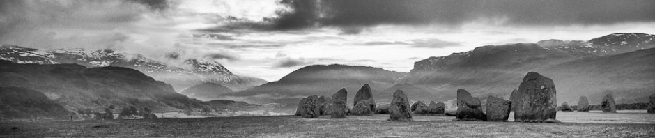
What draws me to mono images? Why do they have such power? Why is it a good discipline to learn in this age of easily manipulable digital colour images?
Mono images have always been manipulated to move the eye of the viewer through to the subject, by dodging and burning to lighten or darken different parts of the image. But the photographer often observes the scene, looking for an image with this process in mind.
This process certainly leads me to focus more on the subject, the essence of the photograph; to look to remove similarly bright (or dark) objects from the composition, in essence to simplify it. Our eyes are mostly drawn to the brightest part of an image; bright colours can also grab your eye and are a great tool in colour photography, but they can also distract. In mono photography you have to remember to think in light and dark, a process which often improves both my colour and mono photography.
The picture of Dunstanbrugh Castle from the ‘cannonball’ beach is a much photographed view and has three key parts, the ‘cannonball’ rocks on the shore, the sea cliff and the castle tower. In my version above, the rest of the image has been ‘held back’ to emphasise these. However, when taking the shot a low viewpoint bringing a group of the rocks strongly into the foreground helped simplify the shoreline, as did the long exposure in removing the waves.
The challenge for me is to do that in my colour images too!


This is great information packed into a blog post! Thanks. I love your work.
Nice shot! A well done B&W photo is a lovely thing – I prefer it because it highlights texture and light more so than color.
On a side note, I shoot raw digital and convert in the raw program – seems to be easier than doing it in Photoshop.
The shot on this post was converted in Lightroom3, but I still think Photoshop gives a bit more control over contrast by being able to apply curves to selected areas – Lightroom Contrast and Clarity seem pretty good but not quite there yet. I need to do this one ‘properly’.